Case study
Nova Dose
An ecommerce experience for a personalised nutrition brand, built on clarity, education and a quiz-led journey.
Problem >
Personalised supplements need explaining before anyone buys. The brand had to make complex nutrition simple while keeping its scientific credibility.
Visitors needed a clear route to either a product or the quiz, without being overwhelmed on the way.
What we did >
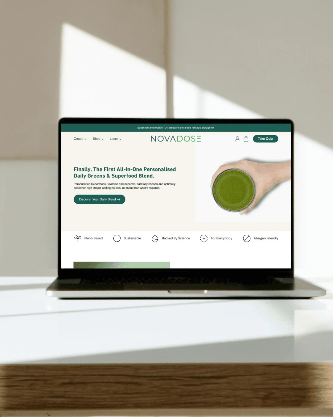
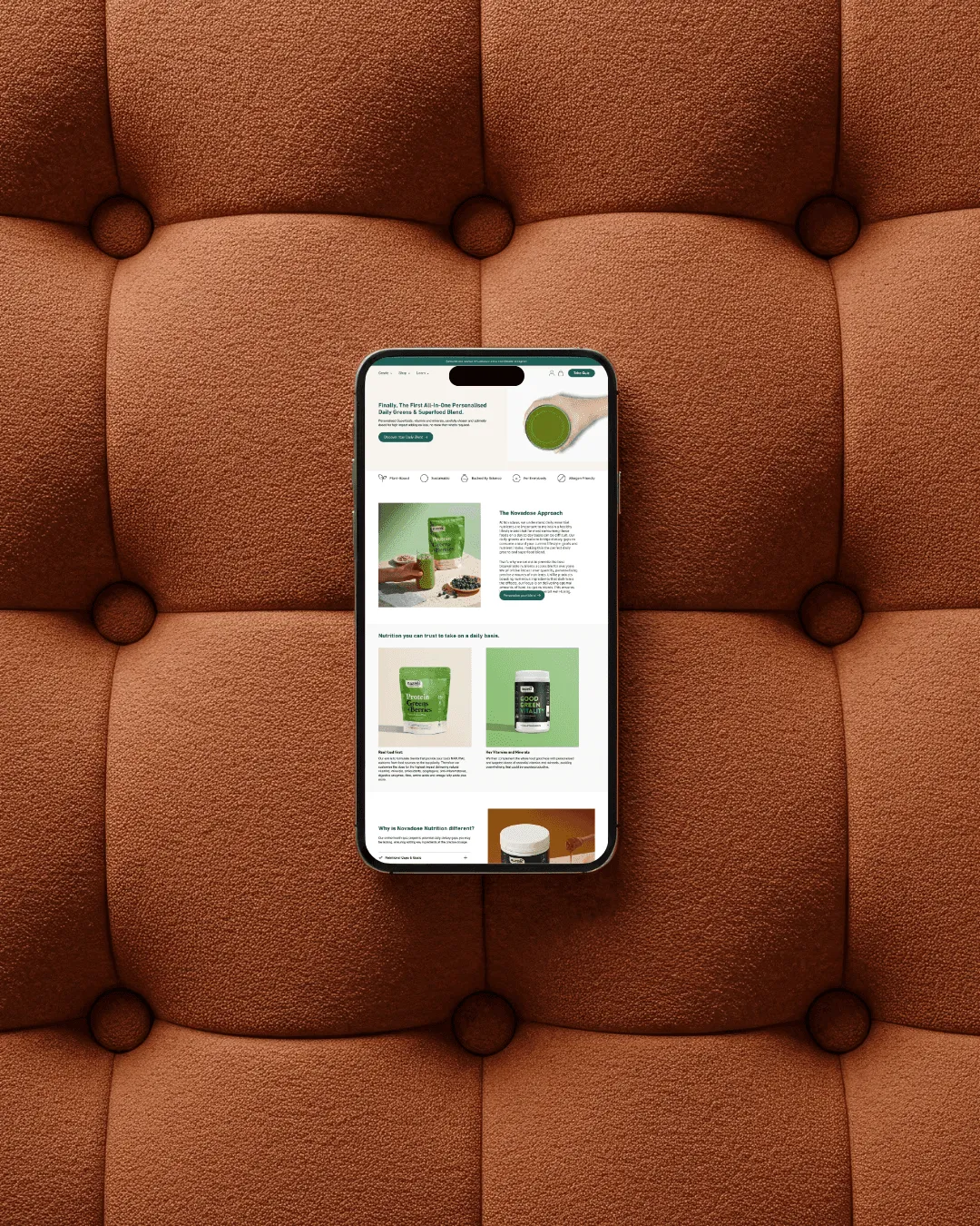
A calm, wellness-led design with a firm content hierarchy, and the personalisation quiz made the main route to purchase.
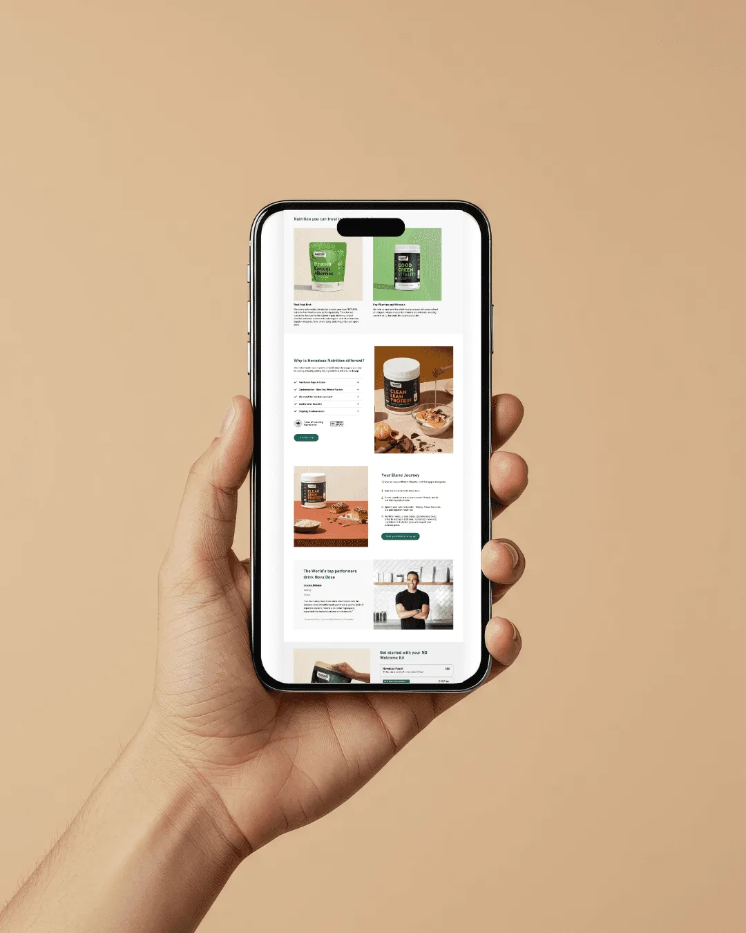
Benefit-led sections, trust badges and short educational copy answer the doubts as they come up. Direct purchase and the guided route both stay one step away.
How we worked >
Health purchases run on reassurance, simplicity and transparency, so the design aims for clarity and calm: soft colour, balanced spacing and short blocks of information.
The quiz entry point is prominent from the first screen. Every section handles one objection, stacks one benefit and moves the visitor toward the next step.
What shipped >
- .01
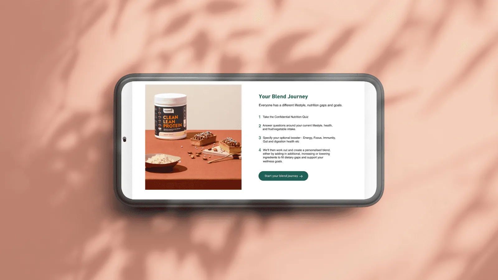
A clean interface that explains personalisation in plain words.
- .02
A morning-routine story that shows where the product fits in a day.
- .03
The quiz and doorstep delivery take the guesswork out of choosing a blend.