Case study
PVRA
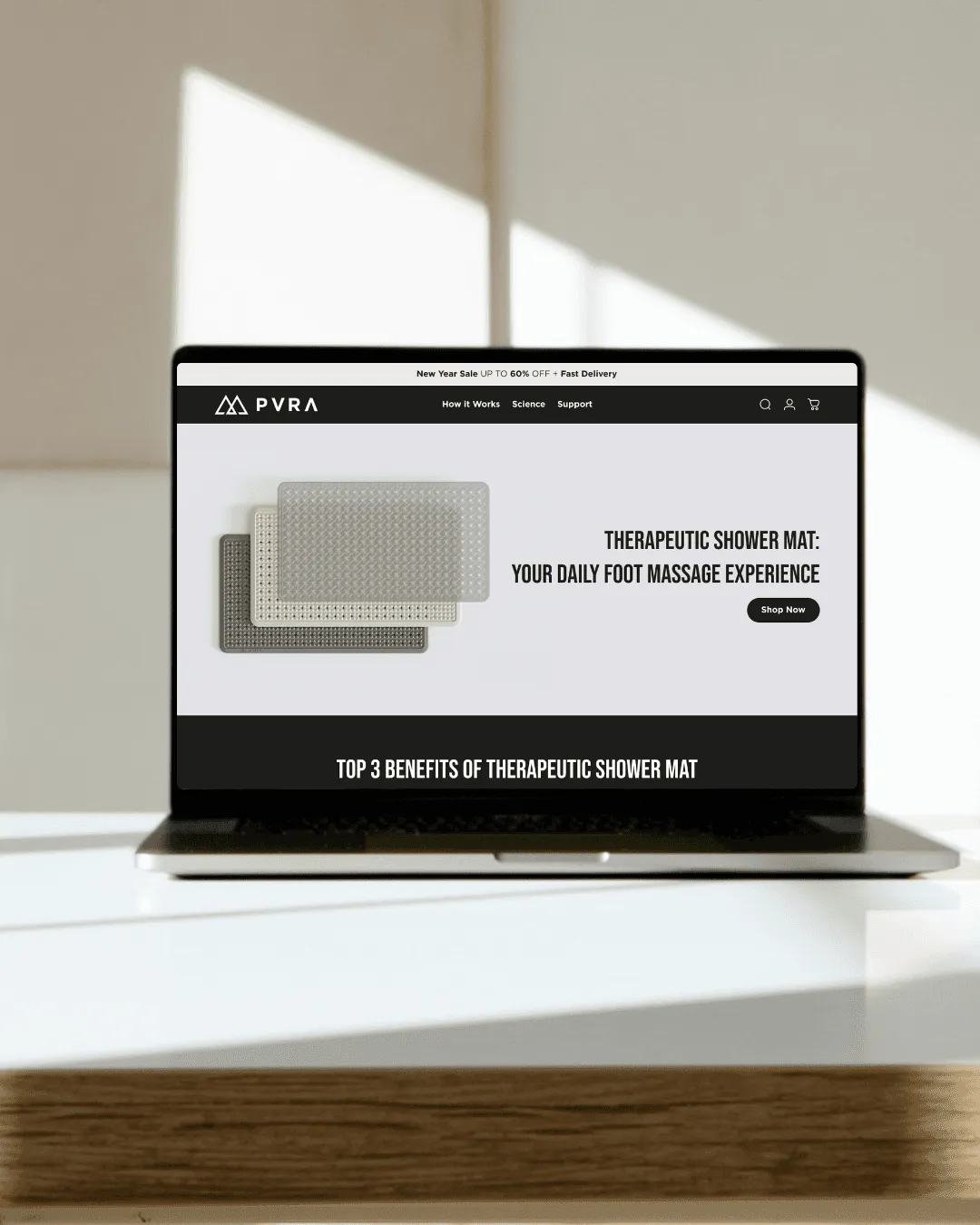
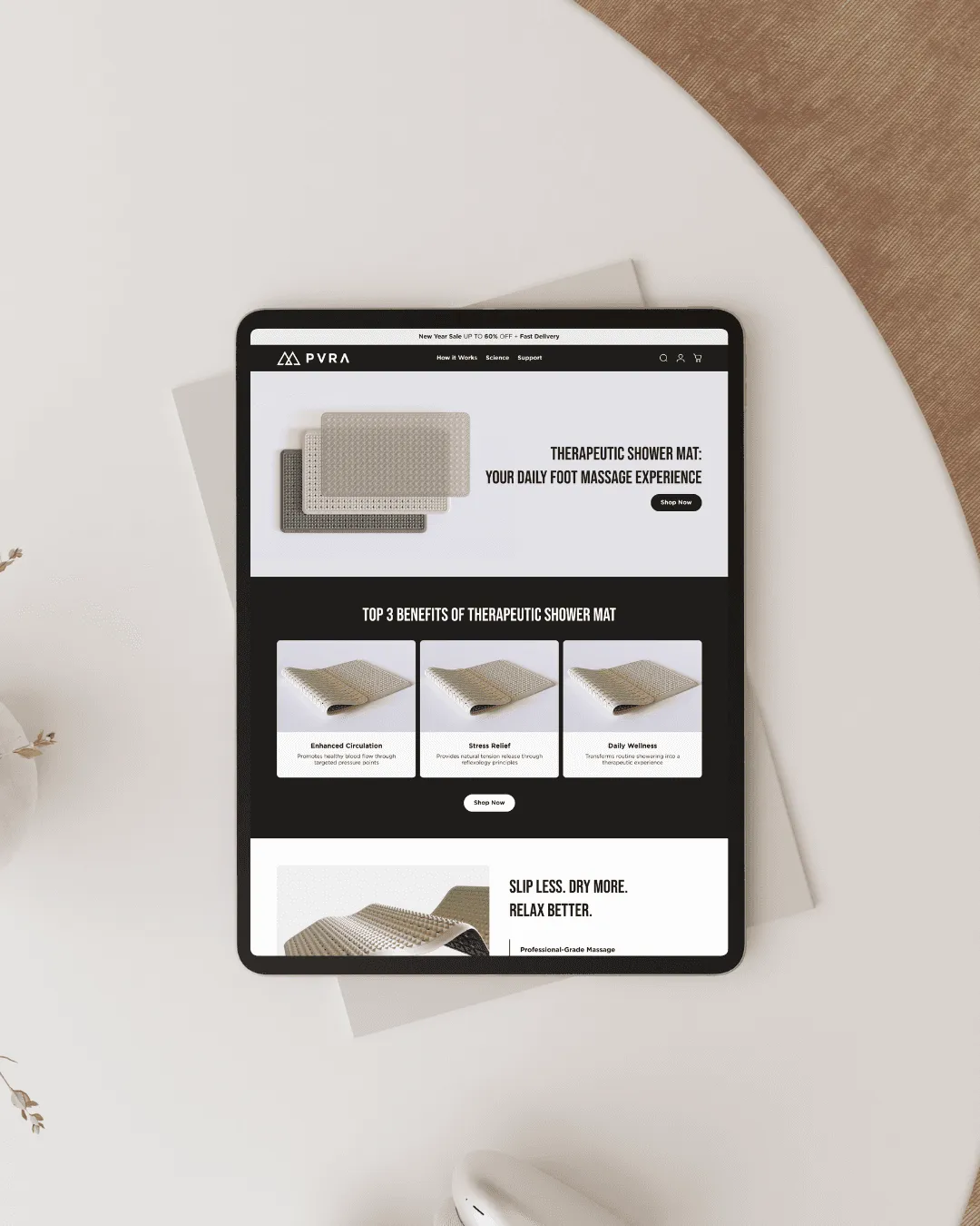
A single-product landing page built to hold attention and raise average order value.
Problem >
A single-product brand has one page to make its case. Weak storytelling and a muddled hierarchy lose the visitor before the benefit lands.
The page had to explain the product, prove it and ask for the order, in that order.
What we did >
Each section answers one question: the problem, the solution, the proof, the action.
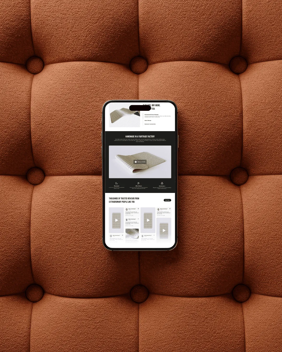
Social proof sits beside the claims it supports, and upsells are placed where they add to the order without slowing the buyer.
How we worked >
CRO research and a competitor review came first. Customer objections and motivations set the order of the content.
Focused messaging and clean visuals keep attention on the product from the first screen to the button.
What shipped >
- .01
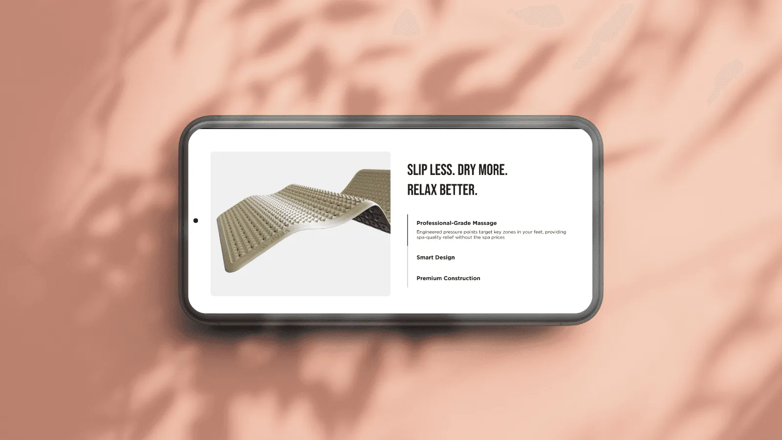
Clear messaging and one action per screen.
- .02
Benefit-led sections and social proof built from customer research.
- .03
An upsell placed after the decision, where it adds to the order.