Case study
Farah Sisters
A fine jewellery store redesigned to match the craft of the collections and to make high-value orders feel safe.
Problem >
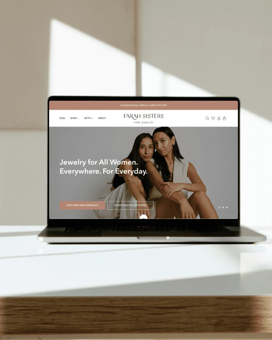
Farah Sisters needed an online store that matched the elegance and craft of their fine jewellery.
The previous site had little story, no premium feel and a buying flow that did not reassure high-intent buyers.
What we did >
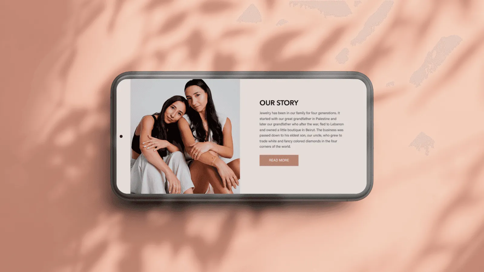
Clean layouts, refined type and large product imagery lift how the brand is seen.
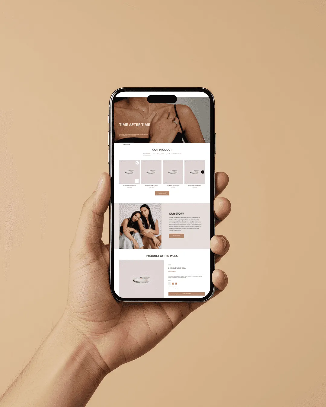
Product pages were restructured around craftsmanship, materials and detail shots, with trust elements and calls to action placed to give buyers confidence at the price.
How we worked >
We started with the brand and with competitors in luxury jewellery, to understand how high-end buyers decide. Spacing and image scale were both chosen to signal exclusivity.
The journey was simplified without losing the premium feel, and subtle motion keeps it modern.
What shipped >
- .01
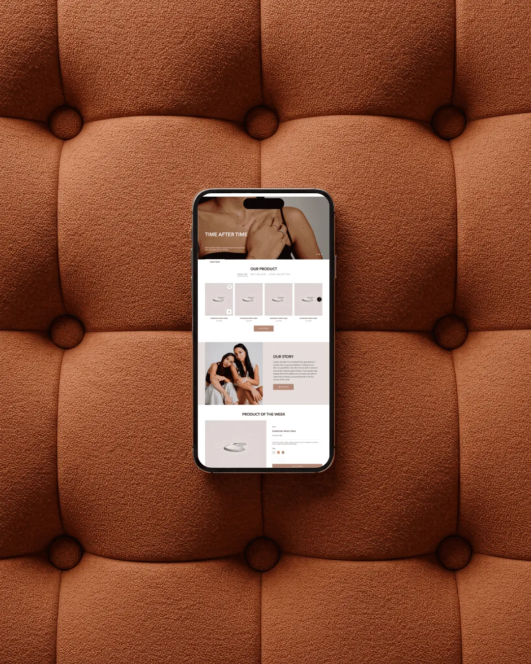
Refined presentation that puts craftsmanship first.
- .02
Ordering and secure delivery explained before the buyer has to ask.
- .03
Product imagery large enough to show the detail a buyer pays for.