Case study
Dense
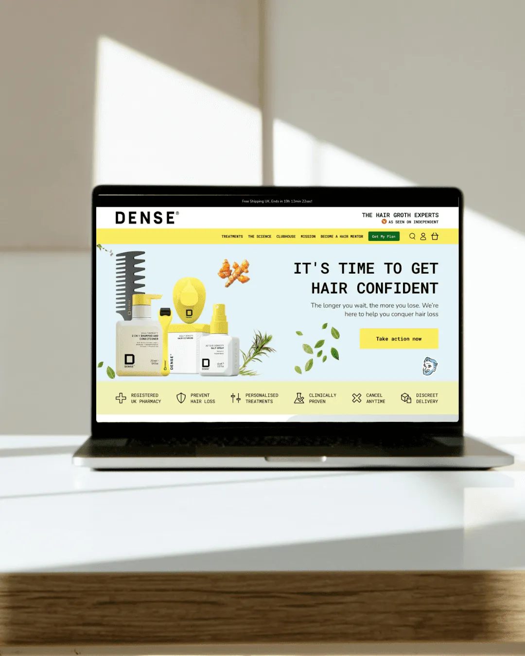
A UX and UI redesign for a hair growth brand, built for clarity, trust and conversion.
Problem >
Hair growth is a trust-sensitive market. Buyers have been promised results before, and most do not believe the next brand.
The old layout had no structured story, a weak hierarchy and no clear next step, so visitors could not see the benefit fast enough to act.
What we did >
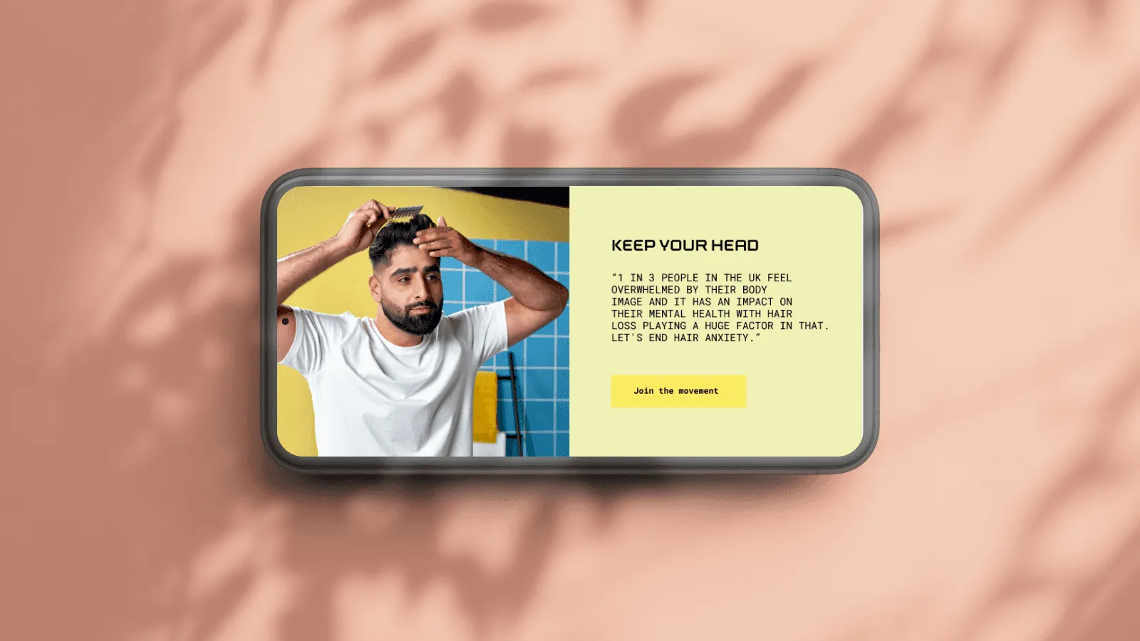
We paired scientific credibility with a bold, confident identity: a strong type system, high contrast and sections built around benefits.
Before and after proof, expert positioning and simpler calls to action were placed where the doubt appears.
How we worked >
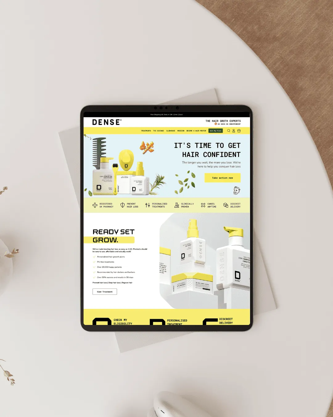
Research into how people buy hair treatments showed three deciding factors: trust, credibility and clarity.
The home page states the science, the expertise and the results inside the first scroll. Every block after that removes a reason to leave and points to the consultation or the product.
What shipped >
- .01
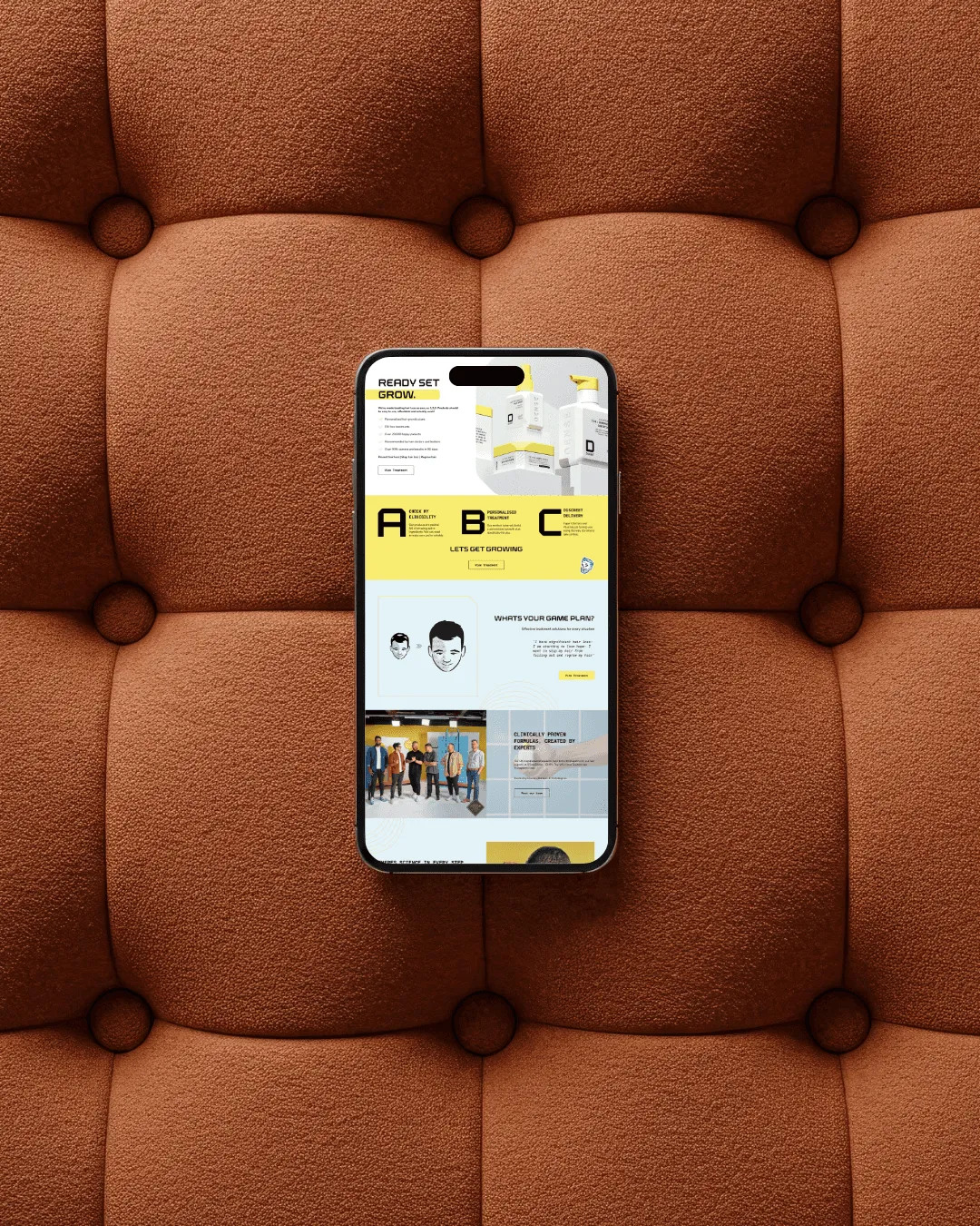
A bold, science-led design system that reads as confident and clinically backed.
- .02
Real customers and their results sit next to the products they used.
- .03
The subscription and consultation flow keeps customers on their routine without interruption.